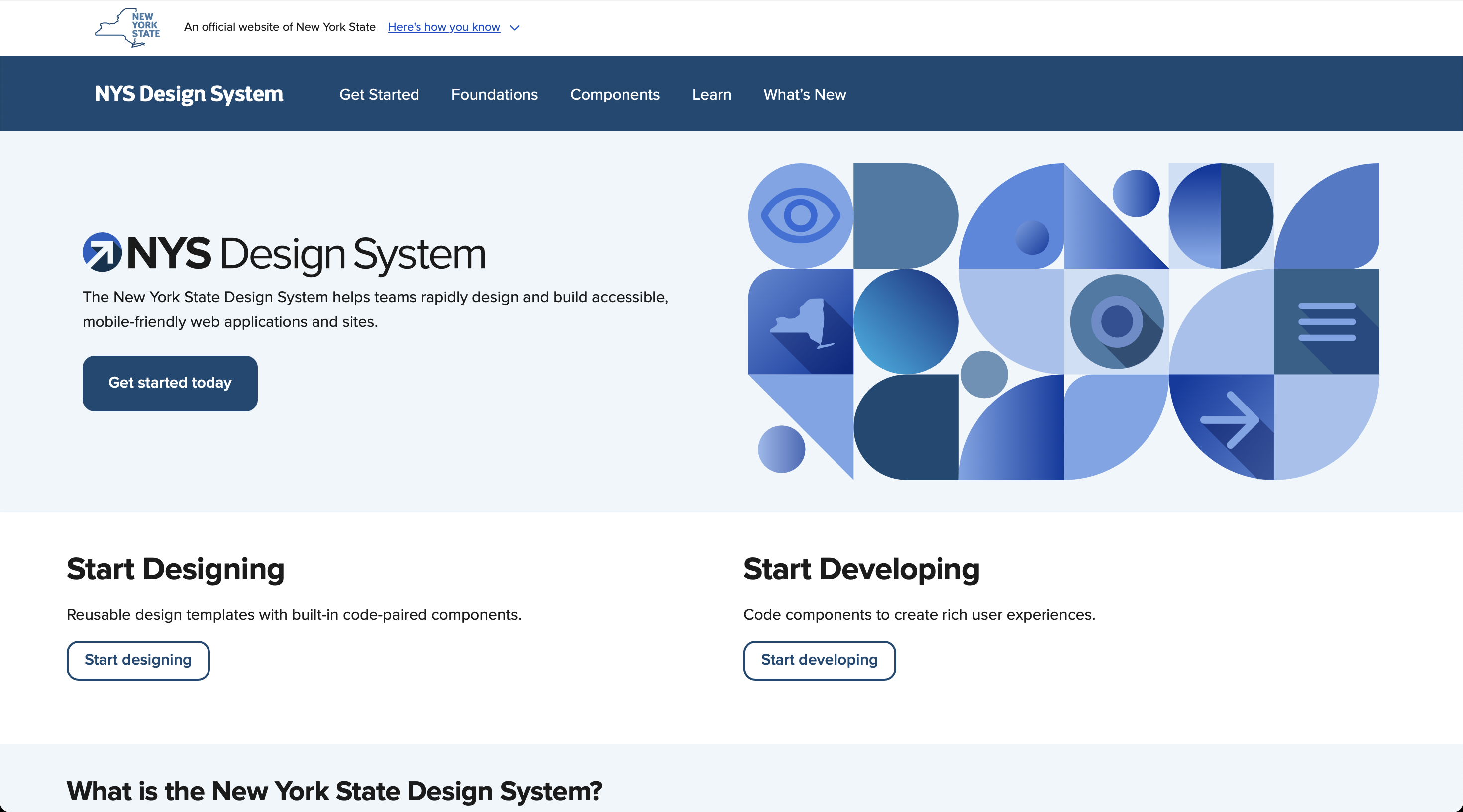
NYS Design System
Building USA's best state design system in under 12 months — 26 accessible components, Figma–code parity, and 50–60% faster design time across 14 product teams.
Lead Product Designer · 60% productivity gains · 50,000+ component inserts across 14 teams · 0.88% detach rate
View Figma file in Figma Community ↗
Overview
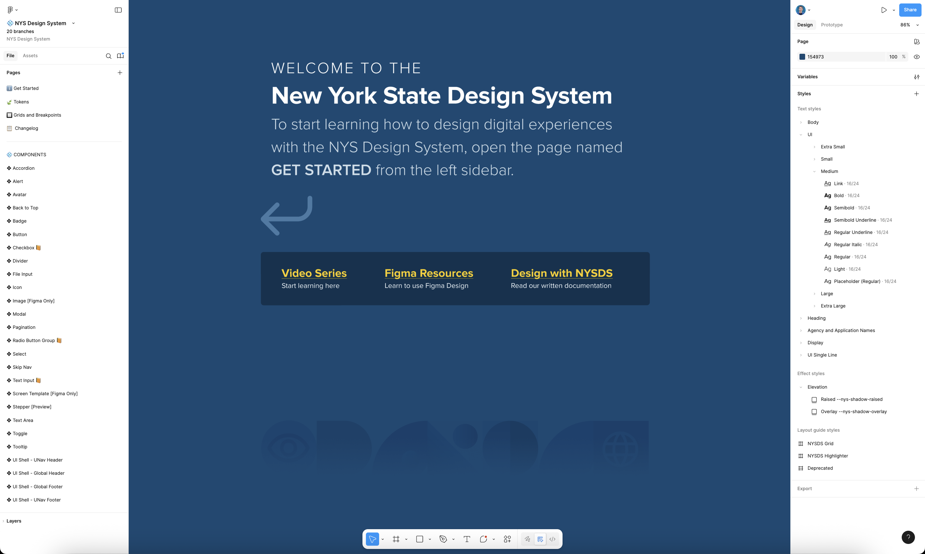
The Context
When I joined the State of New York's Human Centered Design team, there was no unified design system, no component library, and no shared visual language across state agencies. The state's brand guidelines were not being followed by designers and engineers. Each product team designed and developed in isolation, which made accessibility compliance, consistency, and collaboration extremely difficult.
The opportunity was enormous: to create a design system that could unify digital experiences for one of the largest public institutions in the country, ensuring every New Yorker could access clear, usable, and inclusive digital services.
My Role & the Team
I joined as a Product Designer and was promoted to Lead Product Designer within my first six months. I was the last to join the cross-functional design system team of seven people — including 2 designers, 4 engineers, and a brand specialist — working in close partnership with our sister Accessibility Team.
My role focused on building the system's core Figma architecture, designing its most complex components, establishing variable and token structures, and leading documentation and training. I also contributed to the custom-coded documentation site, making the NYS Design System one of the most advanced public-sector design systems in the U.S.
The Challenge
Fragmentation Across Agencies
Before the NYS Design System, state agencies maintained their own UI styles, often duplicating work and missing accessibility standards. Components weren't reusable, and handoffs between design and development caused delays and inconsistencies. In one team's words, "Mockups took twice as long in UXPin as they do now in Figma with the NYS Design System."
This fragmentation not only slowed delivery — it risked inaccessible user experiences for millions of New Yorkers relying on critical public services.
Opportunity for Change
The design system wasn't just a visual refresh; it was a statewide transformation initiative. We aimed to create a design system that would:
- Meet or exceed WCAG 2.1 AA accessibility standards
- Deliver Figma–code parity through Web Components
- Significantly reduce design and development time
In short, this was a chance to build one of the most scalable and accessible government design systems in the country — from scratch.
Strategy & Goals
Design System Objectives
We set four guiding goals:
- Accessibility by default — every component meets WCAG 2.1 AA standards.
- Brand alignment — support all 97 state agencies across 8 parent groups.
- Parity with code — each Figma component has an exact Web Component counterpart with property parity.
- Scalability — build a system robust enough to scale to all team needs, supporting growth far into the future.
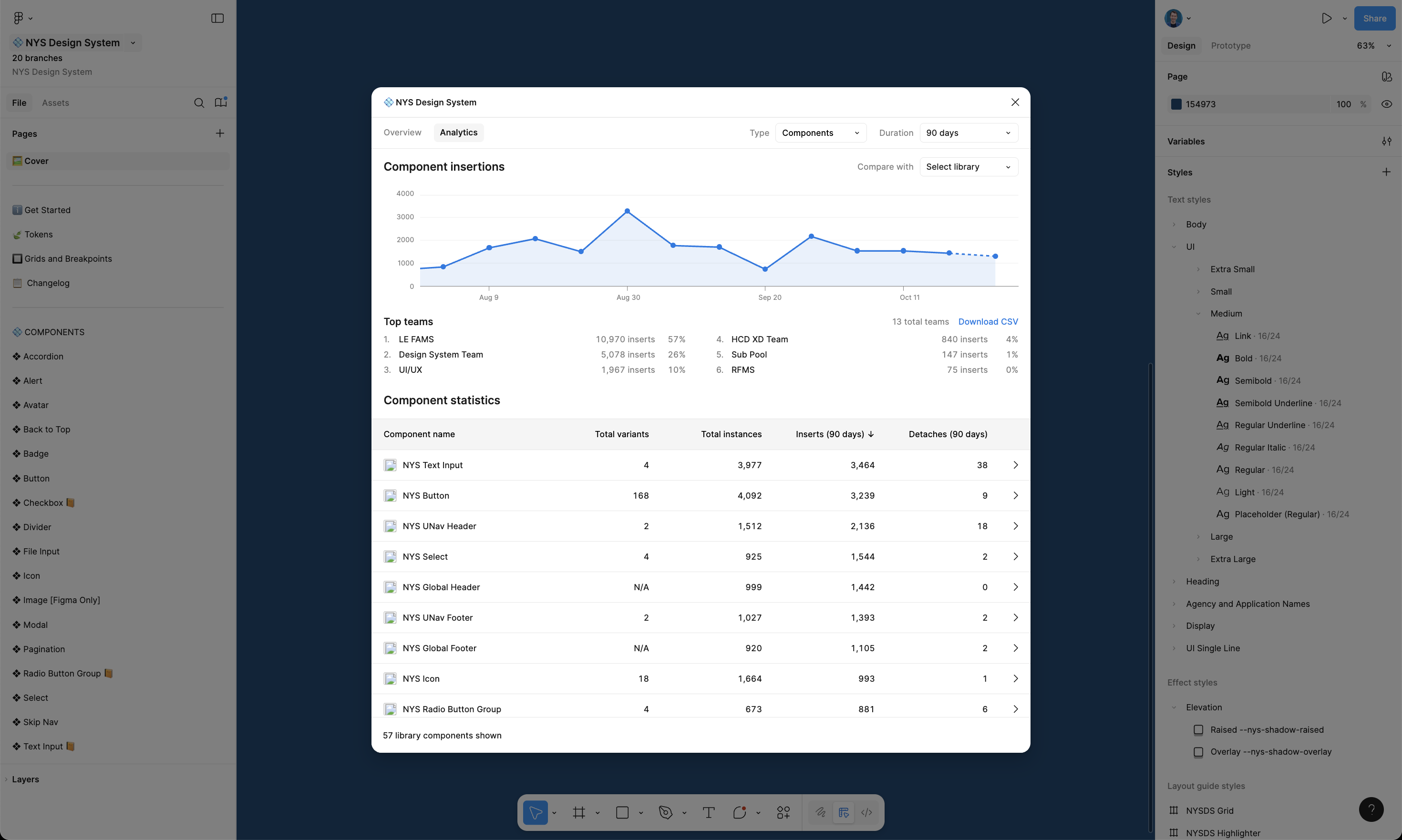
To measure success, I benchmarked progress against the U.S. Web Design System and tracked adoption through Figma analytics — monitoring component instances, detachment rates, and usage across teams.
System Architecture & Planning
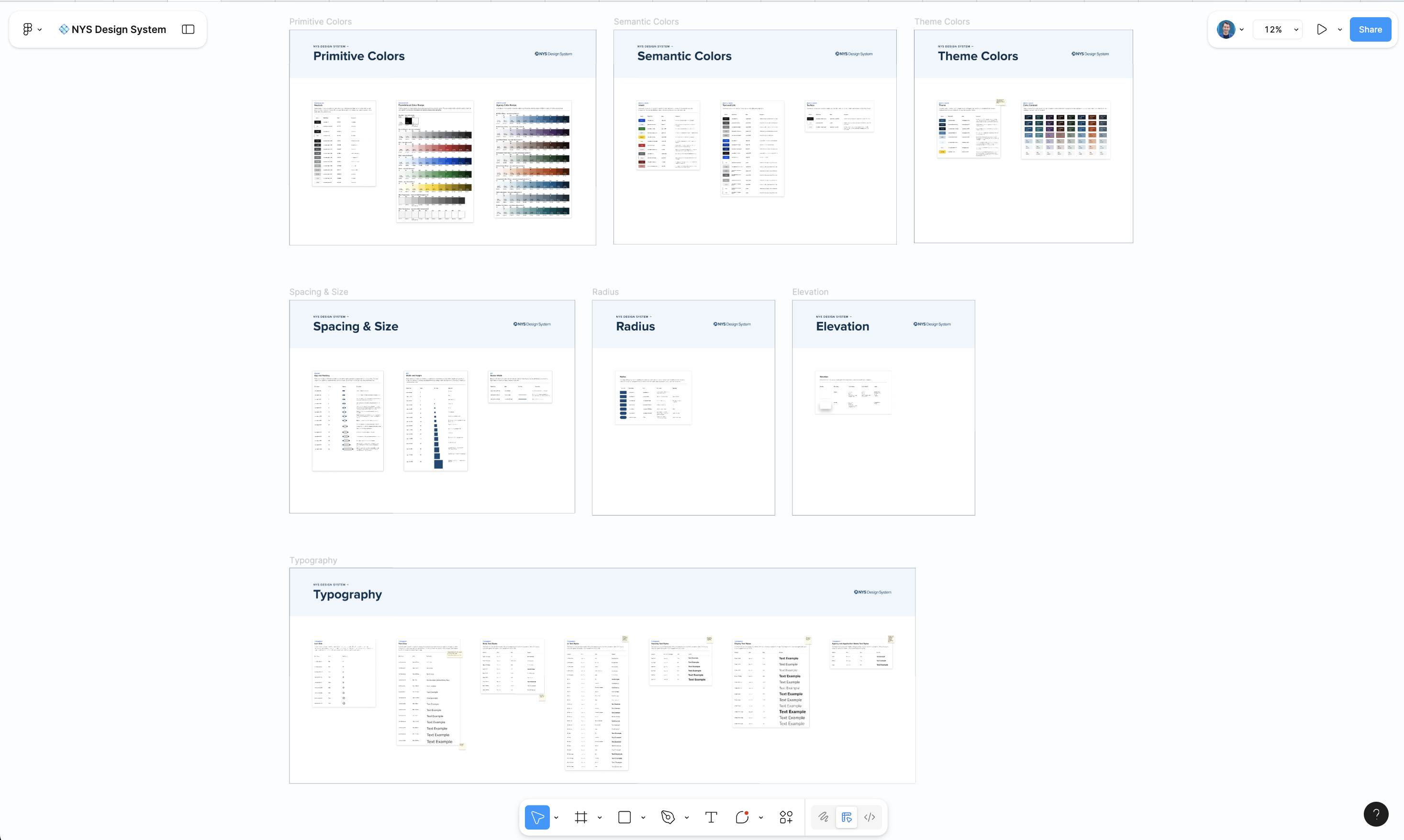
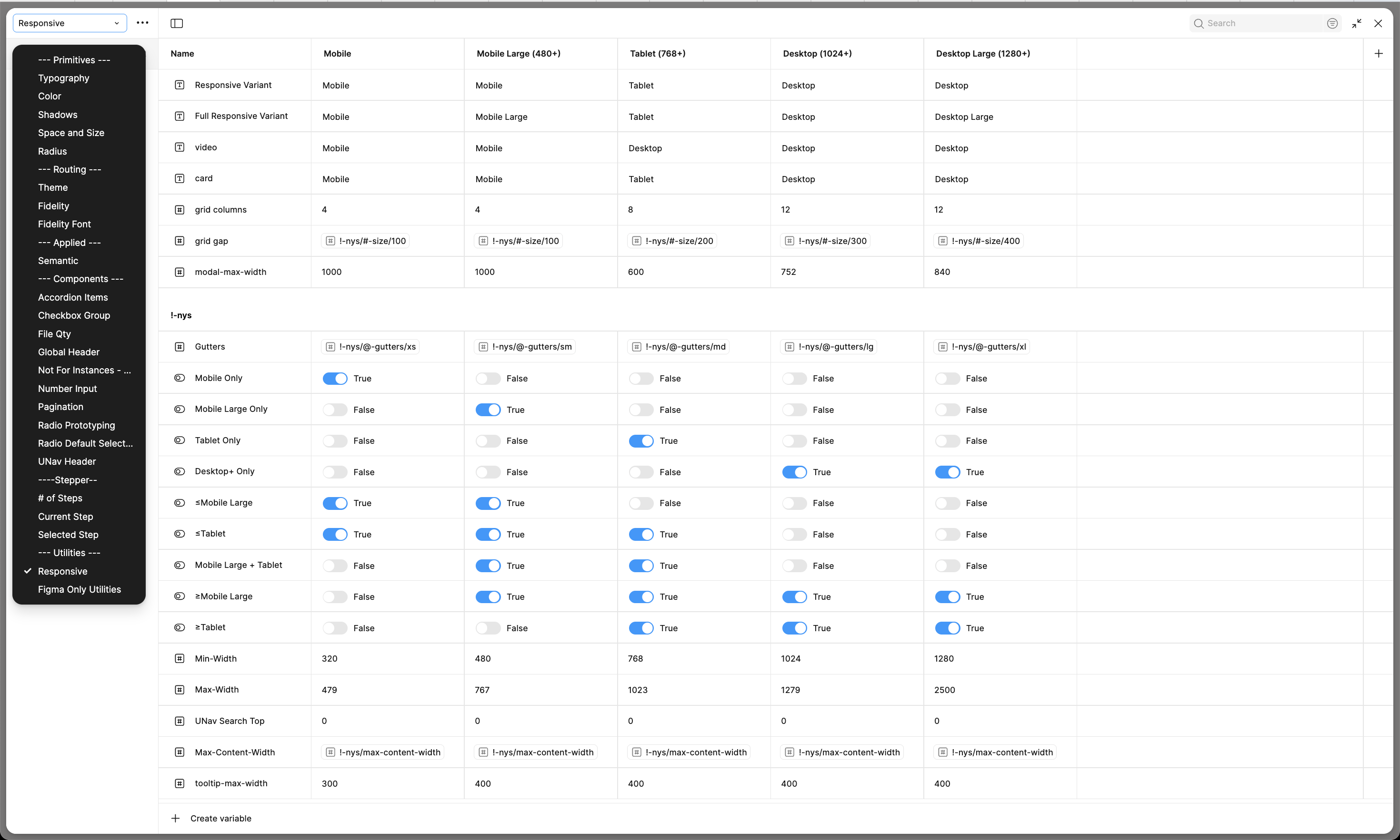
We built the NYS Design System around Figma Variables, Auto Layout, and Code Connect, creating a variable-driven foundation that powers responsive behavior automatically.
I developed internal standards for naming, documentation, and structure that keep parity between design and code. This architecture made the system extensible, future-proof, and ready for token-based governance.
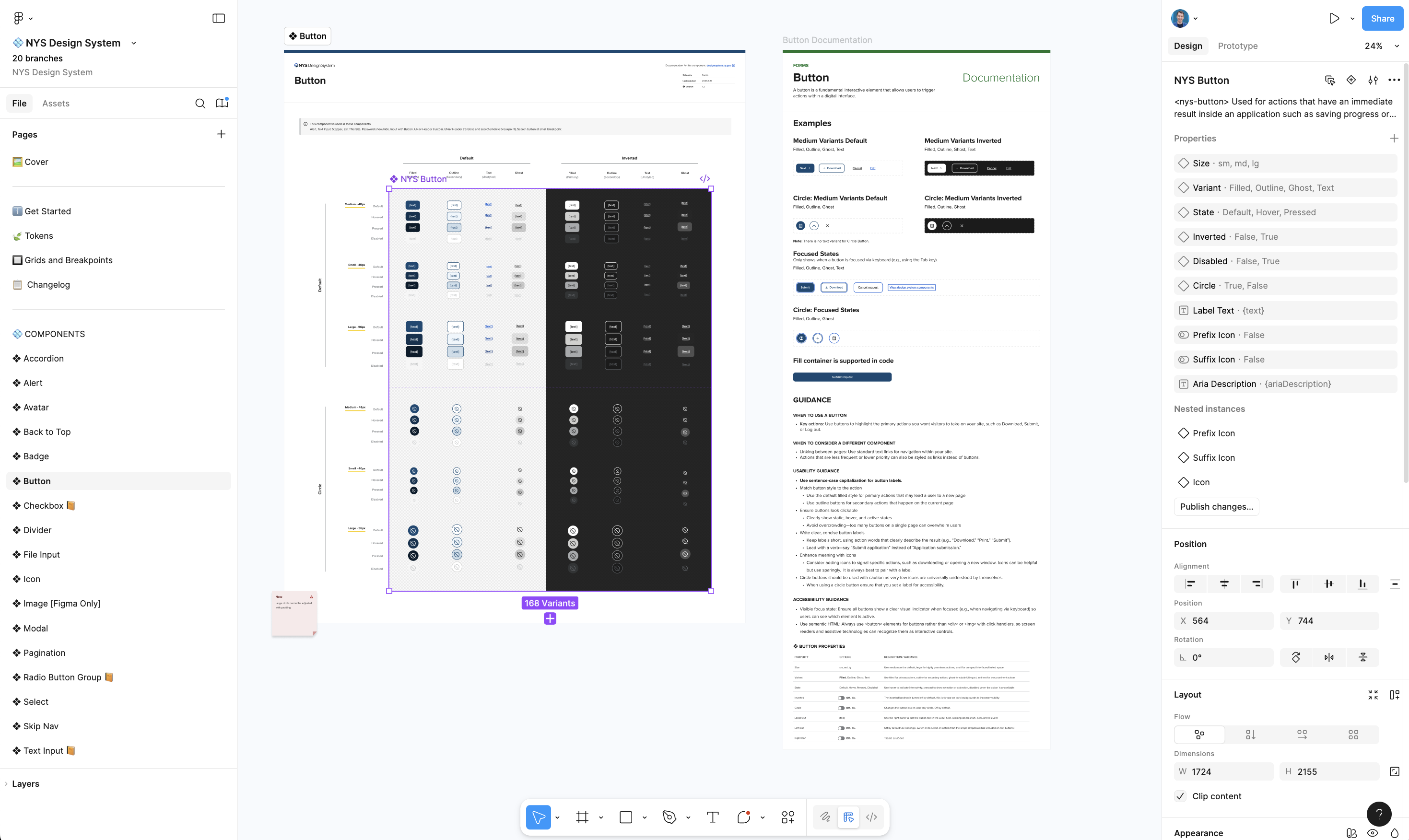
In less than a year, we had achieved 54% parity with USWDS and built 26 highly accessible components — a remarkable pace for a team starting from zero.
Process & Execution
Building the System Foundations
We started with a clean slate: no shared Figma library, no design tokens, no structure. My first priority was to establish a scalable, variable-driven foundation that could evolve without breaking downstream work.
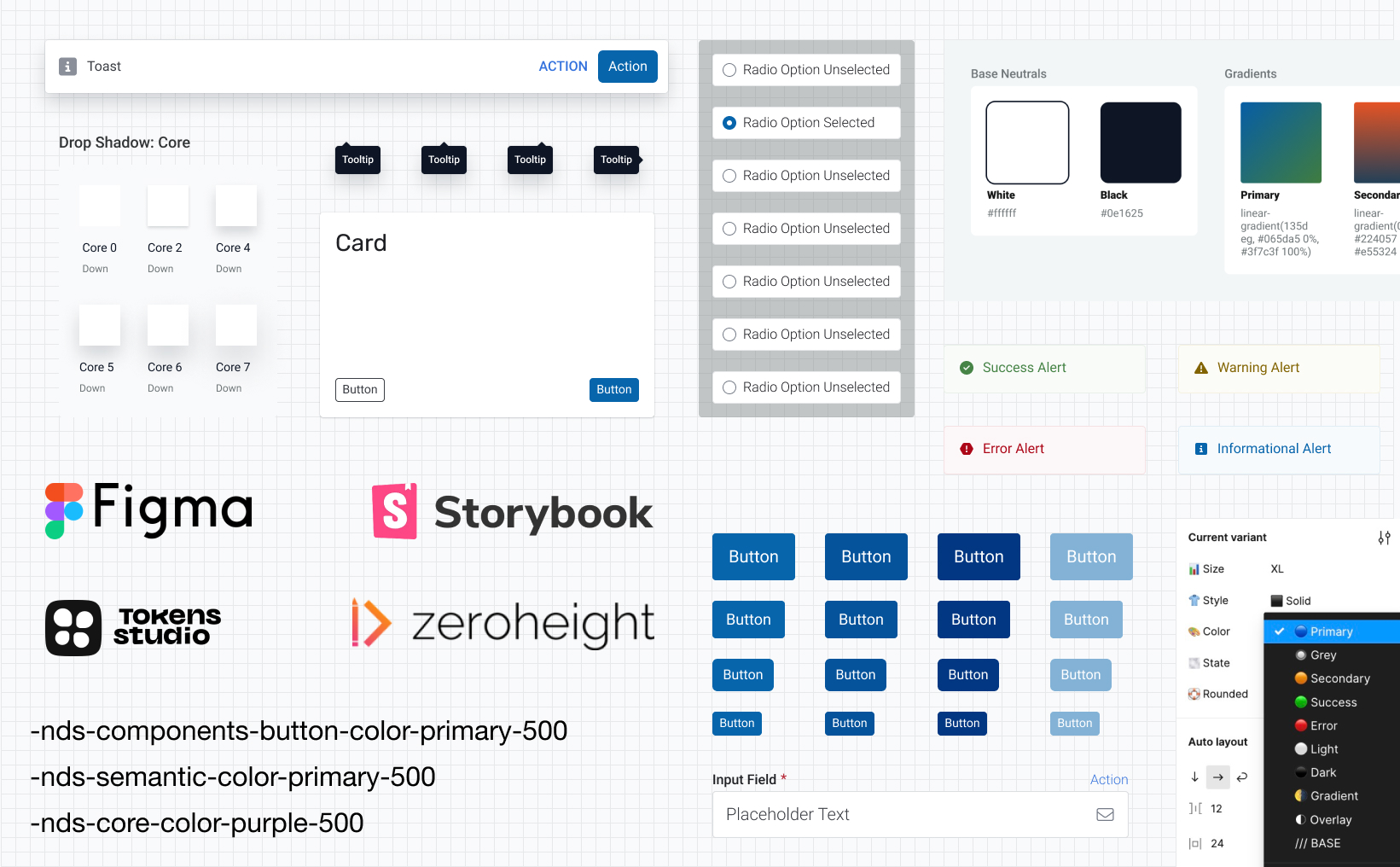
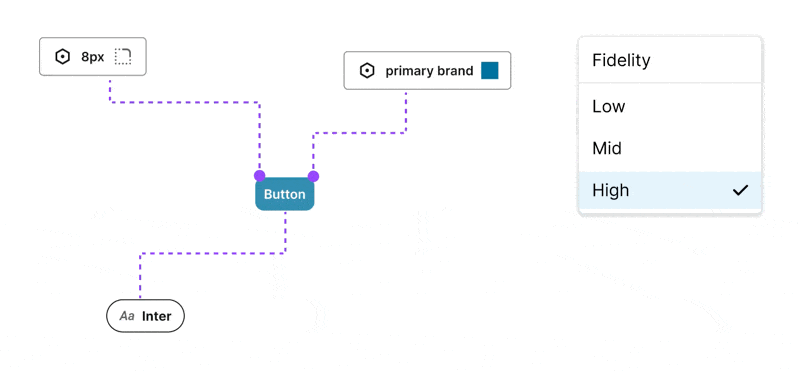
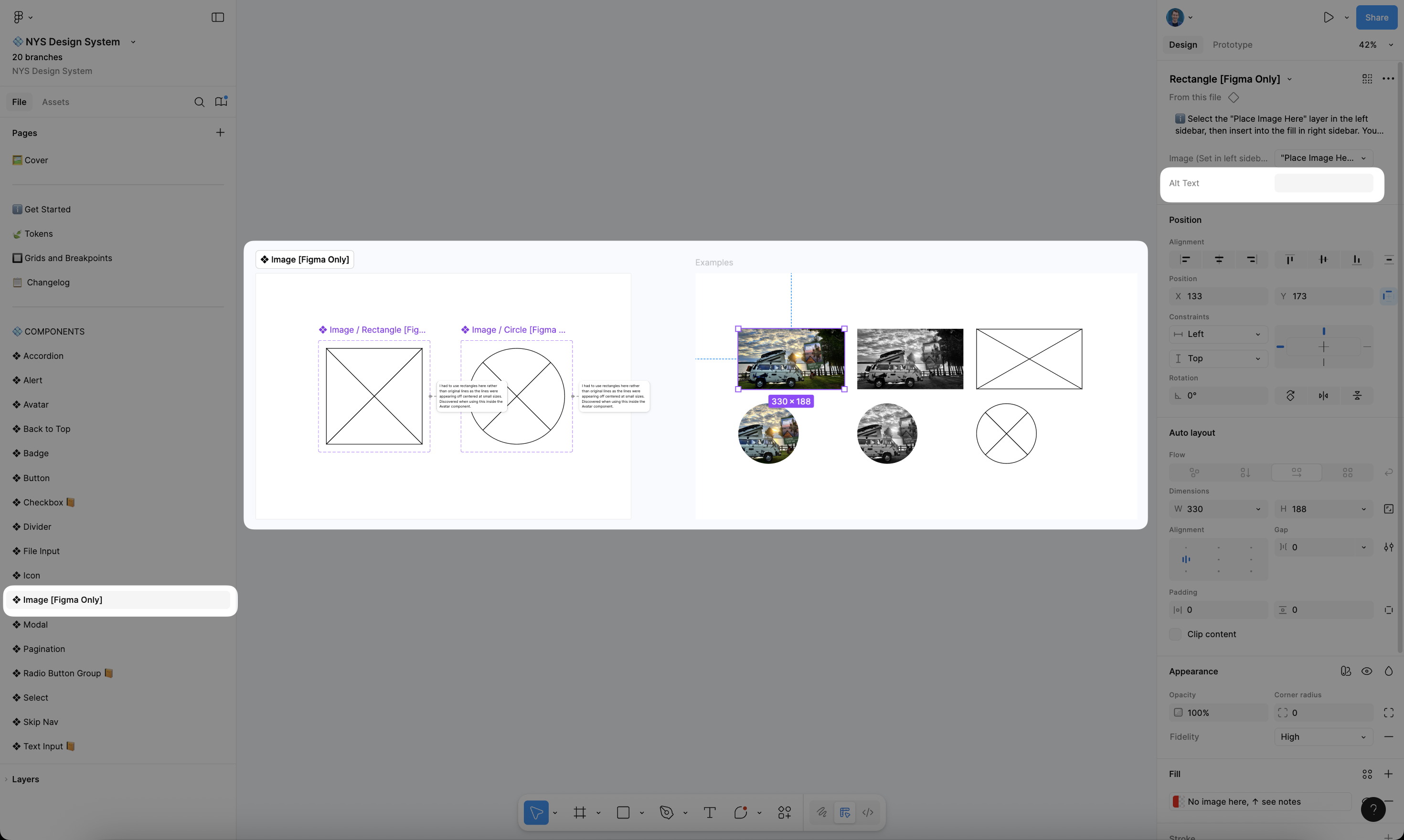
I created the first library of 26 core components and 95 styles, using Auto Layout and Figma Variables to make every element automatically responsive. I also defined a consistent naming convention for all layers and variants, ensuring seamless integration with our front-end codebase through Code Connect.
Our Figma library was architected to serve as a single source of truth — highly structured, documented, and optimized for design-to-code parity.
Introducing "Fidelity Modes"
As our library matured, I saw an opportunity to solve a problem nearly every designer faces — the slow, manual process of switching between wireframes, mid-fi mocks, and final UI.
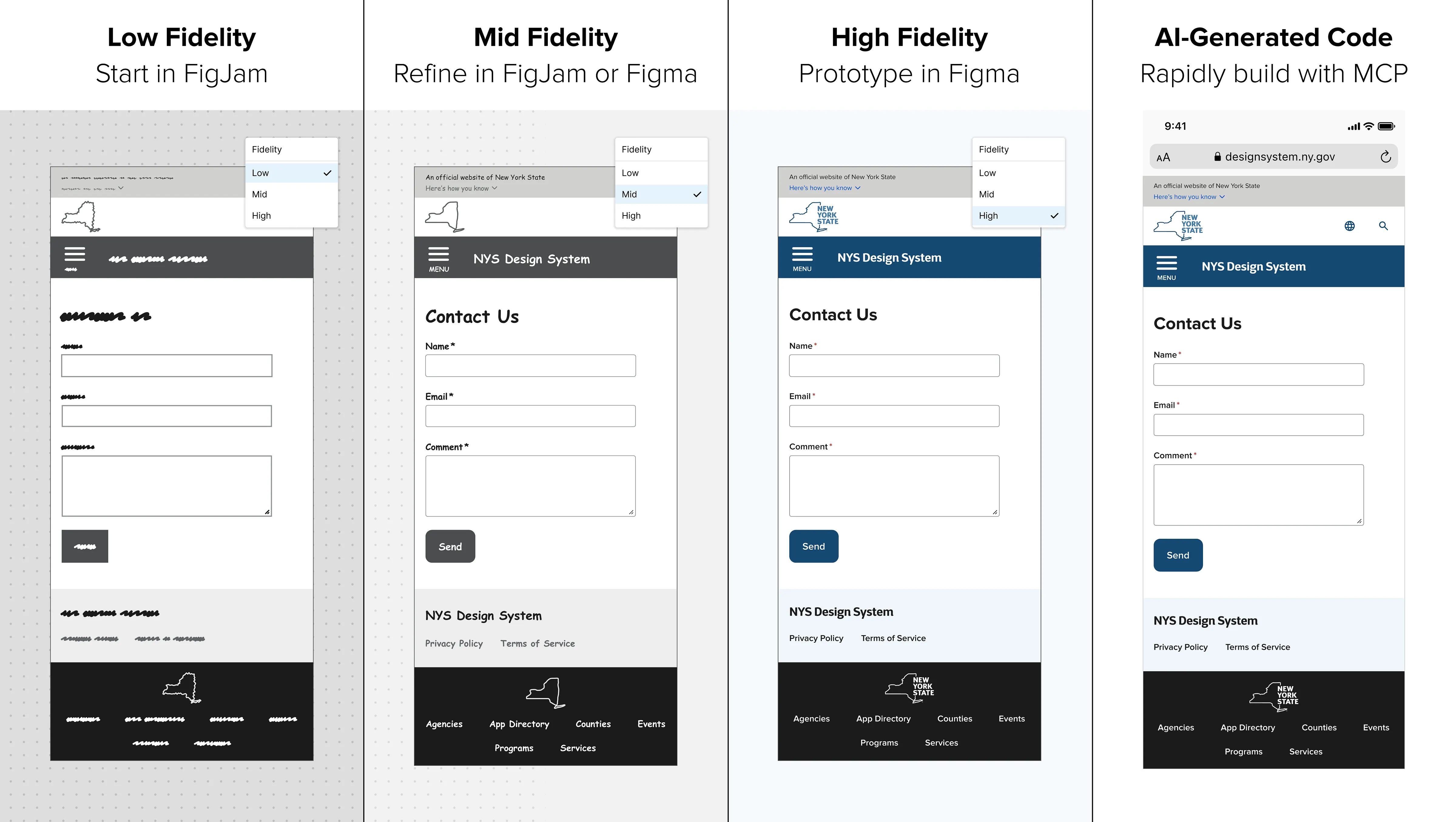
I invented Fidelity Modes, an award-nominated Figma Variable mode that allows designers to toggle instantly between low, mid, and high fidelity — no plugins required. It even works in FigJam, allowing teams to wireframe collaboratively, then paste screens back into Figma with fidelity settings preserved.
This innovation transformed our design workflow — reducing setup time dramatically and improving visual consistency from the very first iteration.
Collaboration with Engineering & Accessibility
Collaboration was built into every step. I worked closely with our lead engineer, two junior devs, and the accessibility team to ensure design and code evolved together.
We mapped every Figma layer to its corresponding semantic HTML element, aligning component naming conventions with code for use in Code Connect. This eliminated the common ambiguity between design intent and implementation, ensuring what we built in Figma was exactly what shipped to production.
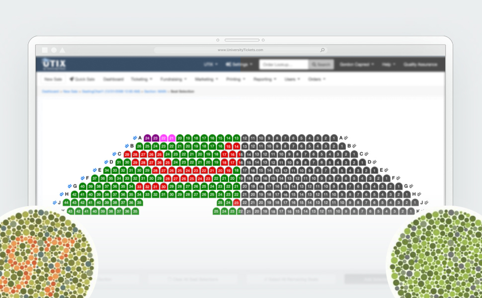
Simultaneously, I partnered with our sister Accessibility Team to make every component meet or exceed WCAG 2.1 AA standards. My background in accessibility from previous roles helped identify and prevent issues early, leading to a system that's inclusive by default.
Documentation & Training
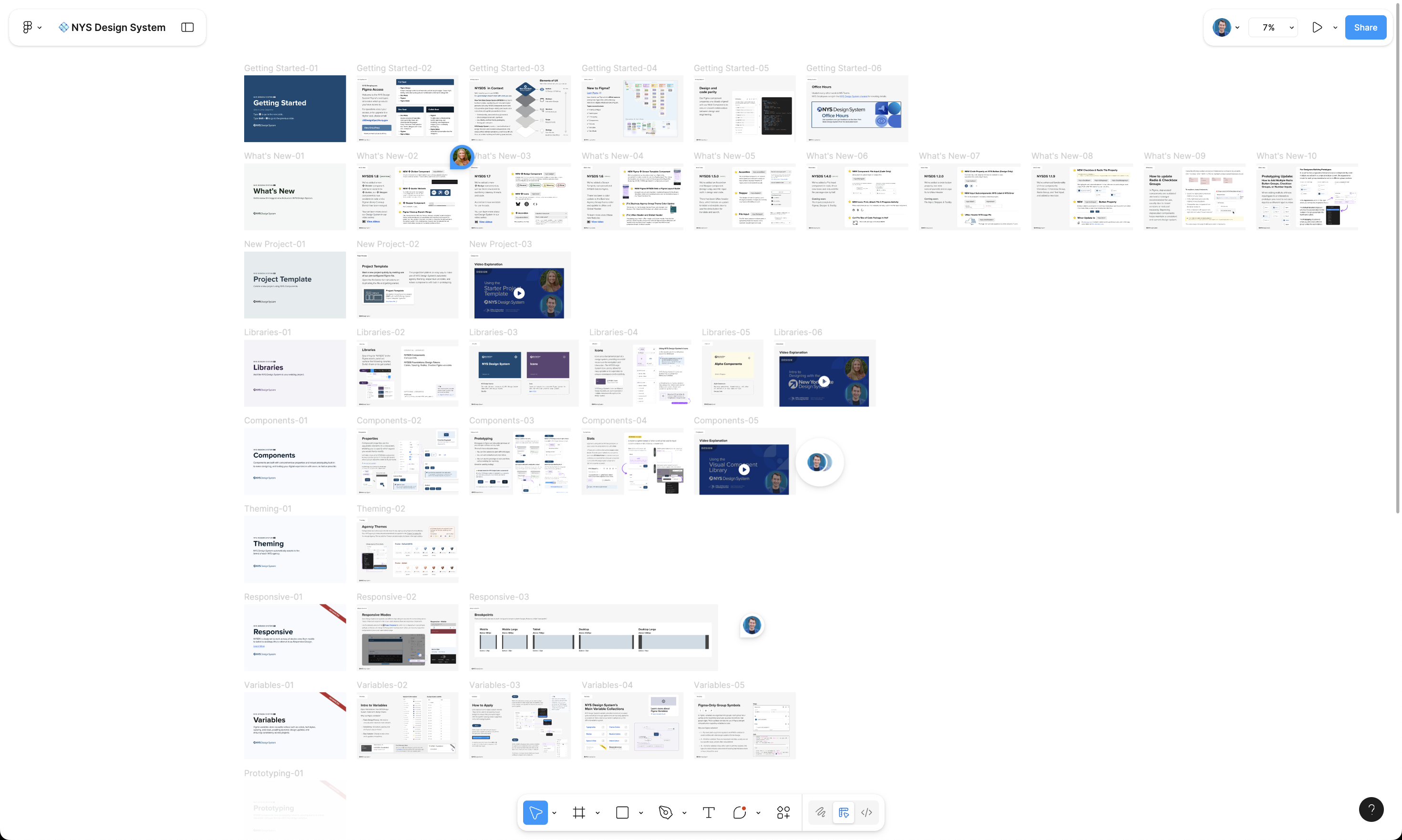
Once our system was stable, I focused on documentation and adoption. I recorded a three-part training video series, built "Getting Started" Figma guides, and hosted workshops with teams across the state.
The goal wasn't just to ship a system — it was to build a community around it. I wanted designers to feel empowered, not dependent, so the documentation was written in plain language and filled with practical examples.
These efforts helped drive remarkable adoption: 14 teams using the NYS Design System within the first year, with 16,052 total component instances and only a 0.88% detachment rate — a strong signal of trust and consistency.
Impact & Results
Quantitative Results
Within our first year, the NYS Design System became one of the most advanced public-sector design systems in the U.S.
- 54% parity with the U.S. Web Design System (USWDS) achieved in 12 months
- 26 accessible, parity-matched components with identical Figma and code behavior
- 14 product teams onboarded, using the system daily
- 38,786 components inserted, with only 0.88% detached
- 50–60% faster design time, according to early team feedback
These numbers reflect not just adoption, but maturity — the system had become integral to how New York State builds digital products.
Qualitative Feedback
The metrics tell part of the story; the feedback says the rest.
Teams across the state love using the design system. One team said: "The NYS Design System is not only improving our efficiency but also enhancing the consistency and quality of our designs." Another said: "There is so much more we accomplish when we work together."
This feedback reinforced that the system was more than just a toolkit — it was a shared foundation for collaboration and design culture.
Innovations & Differentiators
Design Innovation
The technical depth of the NYS Design System sets it apart from most government design systems. From variable-driven responsiveness to auto-layout logic that mirrors CSS grid behavior, the system was engineered to handle complexity elegantly.
I developed multiple Figma-native solutions that reduce the need for custom plugins, ensuring the system remains lightweight and maintainable:
- Fidelity Modes — instant multi-fidelity switching, including FigJam support
- Screen Template component — layout and grid built responsively
- Responsive Components driven by Figma Variables
- Advanced Prototyping that works out of the box
- Accessibility Properties built into Figma via hidden text properties
As of October 2025, designers do not need to install any plugins to use the full functionality of the NYS Design System. These innovations — which exist together in no other design system we've seen — establish the NYSDS as one of the world's most robust and best-built design systems, a north star for government design system possibility.
Workflow Optimization
I worked with the Design System Director to introduce automation and integration improvements to streamline ongoing maintenance.
By aligning Figma MCP, Code Connect, and version control, we reduced the manual burden of syncing design and code updates. Our documentation site updates automatically when component changes are published — turning what used to be days of cleanup into minutes.
The result is a design system that's faster to maintain, easier to scale, and more accurate across disciplines.
Learnings & Next Steps
Lessons Learned
Every design system teaches its own lessons. For the NYS Design System, the biggest takeaway was that governance and collaboration matter as much as components.
I learned that scaling a system isn't about perfect pixels — it's about building trust between designers, engineers, and accessibility experts. Our strongest breakthroughs came from early co-creation sessions where decisions were made together, not handed off.
Balancing flexibility vs. control was another ongoing challenge. We needed a framework robust enough to enforce standards, but flexible enough for each agency's unique use cases. The solution was lightweight governance: shared templates, versioning protocols, and in-system documentation that empowered teams instead of policing them.
Finally, I saw firsthand how accessibility-first design isn't just ethical — it accelerates product velocity. By designing accessible components from the start, we eliminated dozens of post-QA fixes and improved reliability system-wide.
Roadmap Ahead
The foundation is solid — now the goal is evolution, adoption, and education. In the next phase, the team will focus on:
- Achieving 100% parity with the U.S. Web Design System while maintaining New York's accessibility-first approach
- Releasing a full React implementation of all NYSDS components
- Integrating SASS into front-end workflows for improved theming and token management
- Publishing the NYSDS Figma Library to the Figma Community, including an Organization Variable Collection for instant agency rebranding — enabling other states to fork NYSDS as an open alternative to USWDS
- Expanding Figma Variable Architecture to include motion, elevation, and spacing tokens
- Polishing the documentation site with improved navigation and live component demos
- Growing the video learning series with focused tutorials on components, variables, and contributions
- Introducing design system health dashboards to track adoption, usage, and parity metrics in real time
Reflection & Closing
Personal Reflection
This project changed how I think about systems, leadership, and design impact.
Leading the NYS Design System wasn't just about component quality — it was about establishing a design culture grounded in accessibility, efficiency, and collaboration. I learned how to align diverse stakeholders, guide engineering discussions, and scale decisions across 14 independent teams — all while keeping design approachable and human-centered.
Building the NYS Design System reaffirmed a core belief I've carried throughout my career: the best design systems aren't just technical frameworks — they're trust frameworks. They make it easier for teams to make good design decisions, and they help users experience government with clarity and dignity.
The Broader Impact
The New York State Design System has become a blueprint for how large public institutions can modernize digital infrastructure. It sets a precedent for accessible, scalable, and open-source government design — one that other states are already beginning to look toward.
But for me, the impact goes beyond the product. The NYS Design System represents what can happen when design, code, and accessibility unite under one mission: improving lives through clarity and craft.
Recognitions
Directories
Awards
Talks